MCU Power BI Dashboard Project
Summary:
With my interest in Marvel Cinamatic Universe movies and data analysis, I created a fun MCU dashboard in Power BI
to
answer some questions I had regarding the franchise.
Process:
I pulled a public MCU data set from Kaggle and converted it to an Excel file then uploaded
it to
Power BI. When digging into the Kaggle data set, I found that it was three years out of date and
missing
5 of the newest MCU movies. So I searched other websites and manually found and input the data I was
looking for into a new Excel file. Then, in Power BI, I merged the tables together. After some data
cleaning, I created 4 new calculated columns and 2 new measures to answer my research questions. Then
I
created visuals to display some of the most interesting data insights I could find.
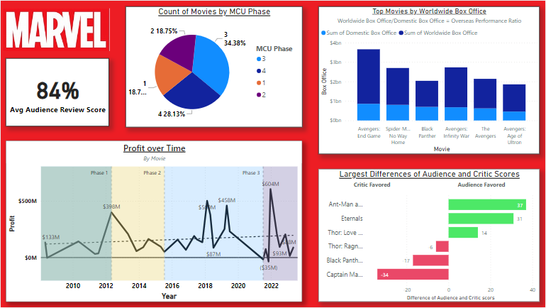
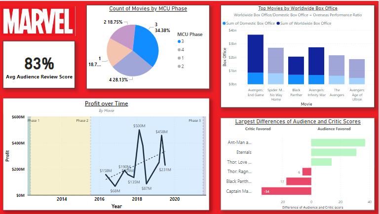
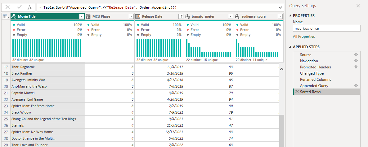
MCU
Project File
Dashboard With Phase 3 Slicer Active
Power Query Column Distribution
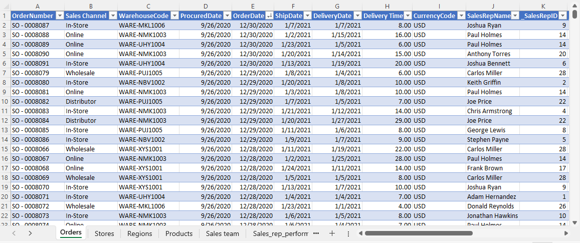
Excel Home Depot Project
Summary:
What started as a simple Excel school project slowly turned into a personal passion project
as I expanded well beyond the assignment. I was working with a mock Home Depot data set and the
assignment was to create a simple graph with a pivot table. But as I worked, I became curious of the
data and decided to make it a personal project. I created an interactive dashboard with slicers and
forecast orders for the next quarter as well as delivery times by region and more!
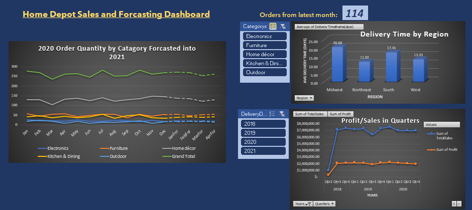
Process:
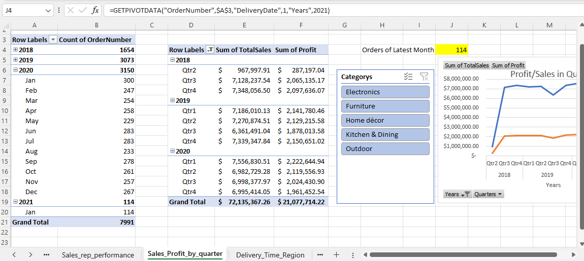
I first created my pivot tables from the data and mapped out what questions I wanted to
answer. Then I used my pivot tables to create the graphs and slicers I would need. For my order
forecasting, I decided to use a custom four-month weighted moving average. I saw that the trend line
was mostly flat, and the variability was mostly seasonal, so I weighted the same month last year to
50% and the previous 3 months 30%, 10% and 10% respectively. Then I formatted the dashboard, and I
had some interesting insights.
Excel Home Depot Project File
Example Pivot Table Sheet
Raw Data Table